"Roobaroo" means face-to-face / becoming aware.
The typeface used for the logo is Quicksand, because of its rounded geometric edges, giving a friendly, minimal, and emotionally accessible feel.
The typeface used for the logo is Quicksand, because of its rounded geometric edges, giving a friendly, minimal, and emotionally accessible feel.
Primary Logo
The Primary Logo consists of the submark + brand name + tagline + ™.
This version is fixed and must not be altered in any way—neither the elements nor their arrangement.
Specific usage guidelines define where and how this logo should be used.
Secondary Logo
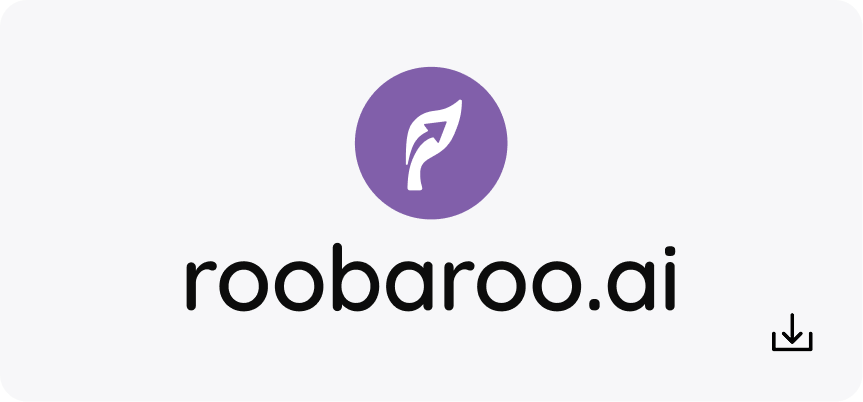
The Secondary Logo includes the submark + brand name, and exists in two concrete forms.
We allow flexibility in how the submark and brand name are positioned relative to each other, as long as:
- Both elements are present
- Each follows its individual usage guidelines
Submark
Our submark visually represents the integration of wellness and growth—core to our brand philosophy.
- The leaf symbolizes wellness, grounding us in care, vitality, and sustainable living.
- The arrow, carved from the negative space within the leaf, represents growth—a forward, upward movement toward potential.
- The design harmony between the leaf and the arrow reflects our mission:
to bring wellness and growth together, in balance.
This interplay is not just aesthetic—it's conceptual. The submark is a quiet yet powerful emblem of our belief that true progress happens when growth is nurtured, not rushed.
Brand Name: Roobaroo.ai
Our official brand name is Roobaroo.ai, not just Roobaroo.
The “.ai” signifies our connection with technology and intelligence—it positions us clearly in a forward-looking space where human connection meets digital evolution.
It also sets us apart in a crowded landscape, establishing us as a human-first, tech-enabled brand.
Tagline
Our tagline reads like a natural sentence, fitting seamlessly into the brand's voice and mental model. It feels like we're talking to the user, not labeling something. It's also structured like a subtitle to the brand name, offering context, intent, and tone at a glance.
Word Play
When the brand name appears without the submark as Roobaroo, we allow creative liberties, provided they follow brand rules. Only the middle double 'O's in Roobaroo may serve as a creative canvas. Such treatments help bring personality to the name while maintaining consistency